Maqueta del Banner Publicitario Estático para Cuji Foods
Empresa familiar latina en Boulder, Co.
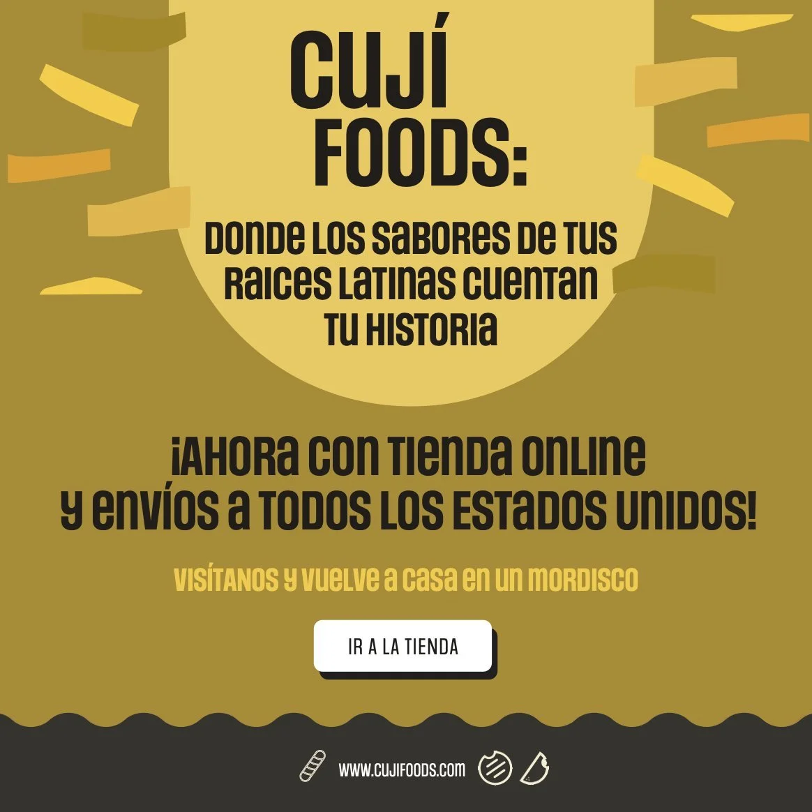
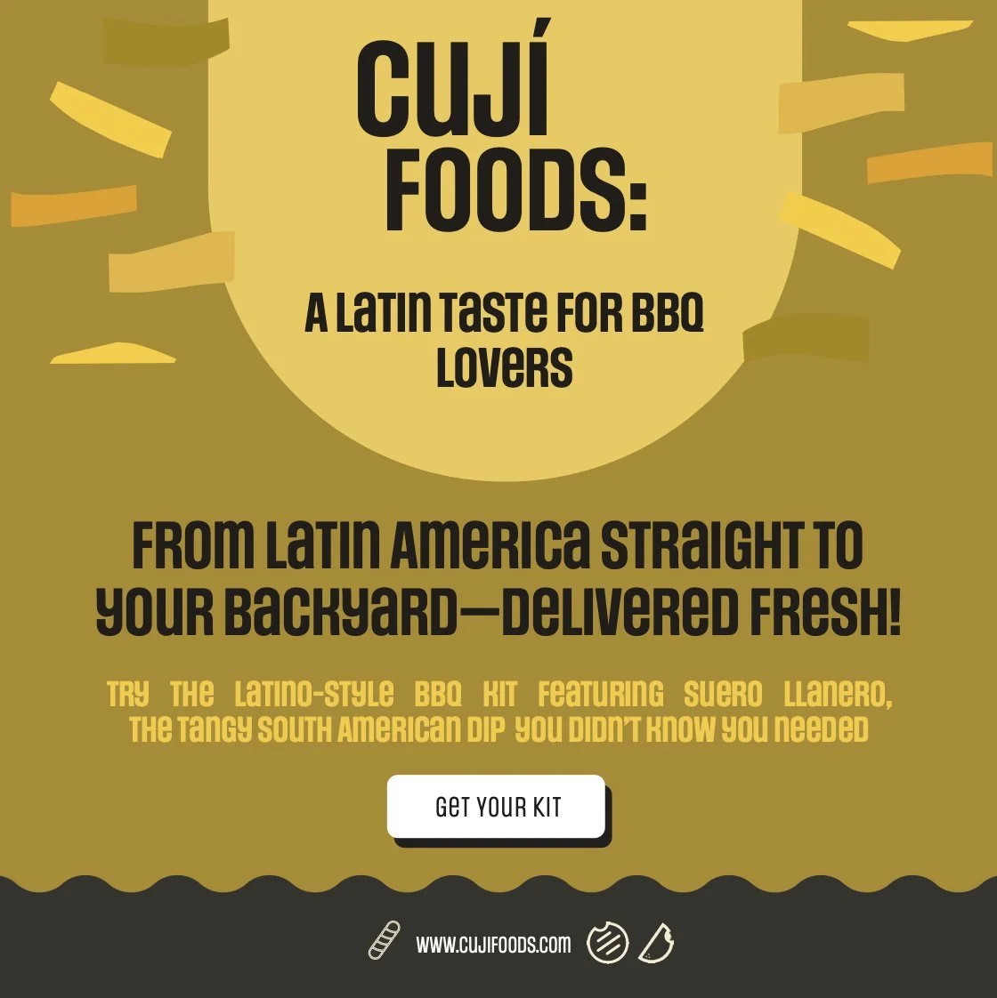
Spec Project:
Bilingual Static Banner Ad for Cuji Foods.
Description:
Cuji Foods is a Latina family-owned store in Boulder, Co., with a second location in Aurora, Co.
Though the owners are Venezuelan, they curated a wide selection of Latin American products, offering a varied range of foods, meats, sweets, and more from across Central and South America.
This static banner for Cuji Foods is designed to appear across social media and websites to inform customers about their new online store and national shipments, and to reach new Hispanic customers.
Cuji Foods also considered it important for their growth to communicate with Americans in English, aiming to make their brand known by Coloradans and Americans in other states. They seek not only to boost sales but to connect on a deeper level with the community they live in, spread pride for their roots, and familiarize American culture with Hispanic products and culinary traditions.
Strategic Approach:
For this project, I crafted the Spanish version first, considering strong emotional aspects important to the Hispanic community, especially for those living in the U.S. who may feel nostalgia for their roots and homeland memories.
The choice of words and tone in Spanish focuses on connecting with nostalgia and offering a visit back home through familiar products.
The English version was fully rethought to resonate with the English-speaking community, transforming the message. The English audience we’re reaching consists of American millennials who are adventurous and passionate about travel, with strong values for cultural diversity.
Thus, the English version connects top-quality South American meats and Latin products to the idea of transforming their barbecues into flavorful cultural experiences—whether they’re driven by culinary curiosity, a love for cultural diversity, or a personal heritage.
While the tone in both languages remains friendly, conversational, and playful to align with the brand’s voice, the Spanish version leans more towards nostalgia, and the English version leans towards fascination with exploring different Hispanic cultures through rich gastronomic experiences.
Click the images to view the full mockup.